Friday, December 30, 2011

Lyme Disease Occurrences in Baltimore County compared to Green Areas

I haven't posted in a long, long time because the semester was a lot of work but now it is over and so is Christmas so now I have a bit of free time. This post is going to be about my final project in my mapping course. The project takes a look at Baltimore County, Maryland and looks at Lyme disease occurrences by zip code and normalized by populations. Here is a map of what that looks like:
The next step was to areas that isolate areas where the deer tick that spreads Lyme disease would be most likely to thrive. The white tailed deer is the main host of the deer tick and they like to live in areas such as: deciduous and evergreen forests, crop lands, and shrub or herbaceous lands. To simply everything I deemed these areas to be "green" and other areas such as residential or developed were "not green". Using a map of land use from the USDA I was able to simplify it to this map:
From this map using Microsoft Excel I was able to find the percentage of land area in each zip code that was "green". After that I made a simply chart that showed the affect of the percentage of green areas has on the number of Lyme disease occurrences in each zip code. Here is that chart:
The chart clearly shows how as the percentage of green spaces in a zip code increases the occurrences of Lyme disease also increase.  
All of the maps were done in ArcMap. If anyone wants to actually read a paper about this I have it. The rest of paper goes into ways of educating the public and other ways to lower occurrences of Lyme disease. Hopefully I will start posting on a regular basis again. 


Tuesday, November 8, 2011

Wonders of the World (Google Earth Style)

This post is going to be not really about maps but more about using Google Earth to quickly tour some of the world's most interesting and historic locations.

This is how a bird might see the Roman Colosseum. Construction started in 72 A.D. and took 8 years to build (not bad for not having any cranes or bulldozers). It could hold a crowd of 50,000 Romans and was used for sporting events such as gladiatorial competitions and was sometimes flooded and used to recreate sea battles.

Here are the Pyramids of Giza. As many people are aware these Pyramids served as tombs for the mummified remains of Egyptian pharaohs. They were created by thousands of slaves and took close to twenty years to complete the largest which was completed around 2560 B.C.

This is an areal view of Stonehenge. Located in England, the exact time this wonder was built is very uncertain (estimates range from 3000 B.C. to 2000 B.C.).  This adds to the wonder of Stonehenge because everything about is a mystery. No one is quite sure of how it was built, who built it, or what the purpose of it is. Many have speculated about the answers to these questions but the real answers will probably never be known.

This is the Great Wall of China. It was built for the same reason most walls are built, to keep something out. In this case it was nomadic people who were constantly raiding areas of northern China. It was built and destroyed many times. Building started in the 5th century B.C. and continued until the 16th century. It is about 5,500 miles in length.

Monday, November 7, 2011

Baltimore Cartography

This post is going to be mostly pictures because I am having a hard time finding information about these maps. I found a bunch of really interesting historic maps of the City of Baltimore. Some of these maps are almost 200 years old. I live right outside of Baltimore and I really like seeing places I've been to being depicted by someone who was living here a century before I was.
This one is from 1872 and was published by John F. Weishampel Jr.
This is from 1954 and published by The Savings Bank of Baltimore. It is depicting Baltimore as it was a century before the map was published. I recently came across a very similar map of Baltimore County hanging in the Towson Public Library. Here is a link to a higher quality version: http://www.library.jhu.edu/bin/f/h/SavingsBankHistoricalMap1854.jpg Also, here is a link to the Baltimore County map I came across: http://28.media.tumblr.com/tumblr_ls3irnG3Bn1r2baauo1_r1_400.jpg I took the picture with my phone so the quality isn't great. Sorry.
This is the oldest map of Baltimore I could find even though I'm sure there are ones even older. It is dated as 1792 and just labels Baltimore City as "The Town of Baltimore" and the Harbor is simply labeled as "Basin".
I was unable to find a smaller size but I really enjoyed this map of Baltimore. It is a 1905 map of the Harbor area. The city looks very similar to what it looks like today.
This is a modern map of Baltimore City who those who are unfamiliar with its layout.

Sunday, November 6, 2011

Unique Globes

Today I just wanted to do a blog post about globes that look different than your average globe.
Halloween was less than a week ago so here's this pumpkin carved to look like a globe.
This on is carved into an apple. I find that even more impressive than the pumpkin globe simply because it is so much smaller.
I love this one just because I love LEGOs. What child didn't love LEGOs growing up? I can tell you from failed attempts that building a LEGO sphere is hard enough. I cannot imagine how much planning went into building the whole world in LEGOs.
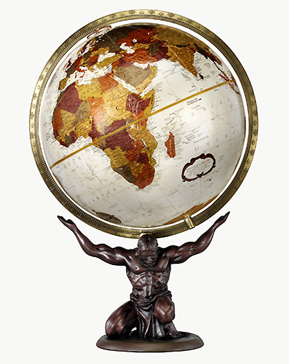
The base is the most interesting aspect of this globe. While the globe itself looks very aesthetically pleasing what drew me to this globe was the base is in the shape of Atlas. Atlas was a Titan in Greek mythology who was forced to hold the Earth up as an act of repentance.
This last globe isn't as unique as some of the others in this post but it has always been my favorite type of globe. I really enjoy how the Earth looks with black oceans. There is nothing more useful or special about this globe it is just a personal preference. What kind of globes do you enjoy?

Wednesday, November 2, 2011

"Upside Down" Maps

Who says North has to be up and South has to be down?
In 1970, a twelve year old Australian drew a map for school with his home, Australia, being at the top of the map. Nine years later, in 1979, Stuart McArthur published his map as "McArthur's Corrective Map of the World". Today this map has sold over a third of a million copies.
Higher quality: http://www.quodlibetica.com/wordpress/wp-content/files_flutter/1285878153McA-23x35-LT.jpg
The "Wizard of New Zealand" produced a "New World Map" that also has his home, New Zealand, at the top of the world. The map uses the Hobo-Dryer Projection which is a cylindrical equal-area projection.
Higher quality: http://flourish.org/upsidedownmap/hobodyer-large.jpg
Finally, for a more history example of upside down cartography we turn to Nicolas Desliens. In 1566, Desliens was living in Dieppe, France which was something of a cartographic hotspot during that period. He decided to map his map with North at the bottom in order to draw attention to his map.

Sunday, October 30, 2011

Cool Maps of the United States

Today I just wanted to highlight a few cool U.S. maps I found recently while browsing the internet instead of focusing on the historical side of cartography.
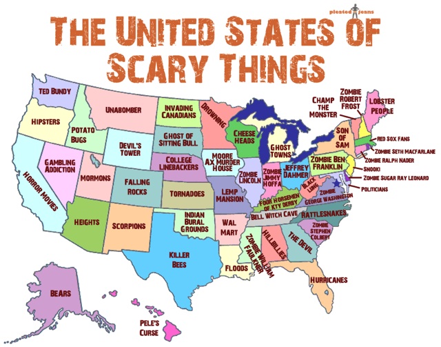
Since Halloween is practically upon us this map here shows what is supposedly the scariest thing for each state. I live in Maryland and according to this map politicians are the scariest thing in my state. I cannot say that I agree with this but still the map is pretty awesome and definitely appropriate for this time of the year. Also, I love how Invading Canadians are the scariest thing for the people of North Dakota.
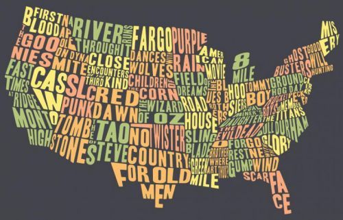
This map here uses no lines to show state boundaries but instead just uses typography to show the area of each state. The map is showing a famous movie shot or at least about in the respective state. The movie for Maryland appears to be "Pecker". I have never heard of this movie let alone seen it so I guess I am a bad Marylander. Still, I am familiar with a lot of the movies on the map and I think this is a great way to present the information in a way that is visually pleasing.
This map is very overwhelming to look at at first. Each state's area is shown with a famous work of art that is from the state. I am not a huge art fan but I found this very interesting. This map is another way to learn an interesting fact about your state's art history.
This final map I found at a site called Visualizing Data. It shows the political affiliation of the U.S. Red represents conservatives and blue shows liberals. This map is really a great way to show something that could have been explained in a paragraph but this way is so much more attractive. I found it really interesting so see how the country was divided pretty much north and south on the eastern portion of the country. I will most likely get back to discussing historical maps on Monday but it is the weekend so I thought we should have a little fun. Let me know if you enjoy this type of post more than the ones I normally do. Any feedback to help me improve this blog would be appreciated. Thanks for the read and Happy Halloween!

Friday, October 28, 2011

Fra Mauro

Fra Mauro was a 15th century Italian monk who created a map that is called by some the first modern world map.
As you might be able to tell from looking at this map it is upside down compared to most contemporary maps. The map was one of the first to include the discoveries made by Marco Polo as well as the amount of Africa shown. Mauro used several sources for the creation of his map including: Marco Polo's book of travels, Arab sources, and the geographic information that was brought to Rome in 1430 by the Ethiopian Embassy. This map is a circular planisphere. It is drawn on parchment and framed. The map is about two meters in diameter. King Alfonso V of Portugal commissioned a copy of this map that was completed in 1459. The map was found in the monastery in San Michel. Today it can be found The Biblioteca Nazionale Marciana (National Library of St. Mark's) in Venice, Italy.